Mastering the React Pro Sidebar

Brief: Through this article, we aim to deep dive into one of React’s powerful features, the React Pro Sidebar, a flexible library for creating professional and customizable sidebars. We will explore how the React Pro Sidebar works and break down its key components. We will also build various types of sidebars and learn about integration methods using React Router, helping you create responsive and dynamic navigation menus with ease.
Introduction
Navigating through modern web applications and web development requires a well-structured sidebar. A sidebar enhances user experience by providing components for creating high-level and customizable seamless navigation. When working with React applications, the React Pro Sidebar is a powerful and customisable library that simplifies the creation of side navigation panels.
What is React Pro sidebar?
React Pro Sidebar is a customizable and responsive sidebar library that is built on React and provides utility classes for developers. It is a tool for creating app layouts with navigation menus and supports unlimited nested submenus. The library provides various skins for customization.
It offers:
Collapsibility
Responsiveness
Customization of themes
Submenus
Icon Support
With these features, it can trigger responsive behaviour and become an excellent choice for dashboards, admin panels, and any web app requiring a sidebar.
It's like a toolkit full of beautiful, utility classes and ready-to-use building blocks (like buttons, forms, cards, dialogs, etc.) that help developers build sleek, consistent, and responsive web applications faster and with less effort.
What is MUI?
Material UI (now called MUI) is a popular React UI framework to import into an app that provides a set of pre-designed components based on Google’s Material Design system.
Key Features:
Customizable
Component-Rich
Responsive by Default
Accessible
Installation of React Pro Sidebar Package:
First, you ensure you have Node.js and React installed on your system. Then, you can install the React-Pro-Sidebar package using npm or yarn:
npm
npm install react-pro-sidebaryarn
yarn add react-pro-sidebarInstallation of Material UI in your React project:
npm
npm install @mui/material @emotion/react @emotion/styledyarn
yarn add @mui/material @emotion/react @emotion/styledThat’s it. You’re ready to use MUI components!
React Pro Sidebar Components :
Sidebar component
The main wrapper layout component for the sidebar.
Can be collapsed or expanded.
Props :
Prop | Type | Description | Default |
|---|---|---|---|
collapsed | boolean | Controls whether the sidebar is collapsed. | false |
toggled | boolean | Controls whether the sidebar is toggled on small screens. | false |
rtl | boolean | Enables right-to-left mode. | false |
width | string | Sets the sidebar element width. | "250px" |
backgroundColor | string | Changes the sidebar background color. | "#ffffff" |
image | string | URL of the image to set as the sidebar background, with transparency applied to the background color. | - |
transitionDuration | number | Defines the transition time (in milliseconds) used for the sidebar's collapse and toggle behavior. | 300 |
Menu component
The menu component is a wrapper component that holds multiple menu items.
Props :
Component Prop | Type | Description | Default |
|---|---|---|---|
closeOnClick | boolean | If true, and the sidebar is collapsed, the submenu popper will automatically close when a MenuItem is clicked. | false |
menuItemStyles | MenuItemStyles | Style the MenuItem and SubMenu components along with their child elements. | - |
renderExpandIcon | (params: { level: number; collapsed: boolean; disabled: boolean; active: boolean; open: boolean; }) => React.ReactNode | Render method for customizing the submenu expand icon | - |
MenuItem element
The MenuItem element represents a single clickable item inside the sidebar.
Can be linked to different routes using onClick or href.
Props :
Prop | Type | Description | Default |
icon | ReactNode | Adds an icon next to the menu text. | - |
active | boolean | Highlights the active menu item. | false |
SubMenu components
SubMenu element is used for nested menus (dropdown menus).
Props :
Prop | Type | Description | Default |
icon | ReactNode | Icon for submenu | - |
label | string | ReactNode | Label for the submenu | - |
rootStyles | CSSObject | Apply styles to the SubMenu element | - |
Setting up sidebars
Building a basic sidebar-
Create a React app using Vite. For styling, use Tailwind CSS.
Creating a basic sidebar is very simple. In a React project, create a component folder inside the src folder.
Inside the component folder, create a SidebarComponent.jsx component and import that component in the App.jsx component.
The folder structure is shown in the image below.

We have to bring in the Sidebar, Menu, and MenuItem components from react-pro-sidebar.
Using imported components, we will construct a basic sidebar in SidebarComponent.jsx and apply some fundamental styling, as displayed below.
SidebarComponent.jsx
import { Sidebar, Menu, MenuItem } from 'react-pro-sidebar';
import { Box, Typography } from '@mui/material';

const SidebarComponent = () => {
 return (
   <Box sx={{ display: 'flex' }}>
     <Sidebar
       rootStyles={{
         height: '100vh',
         backgroundColor: '#90caf9',
         color: '#000',
       }}
     >
       <Menu
         menuItemStyles={{
           button: {
             padding: '10px 16px',
             '&:hover': {
               backgroundColor: 'rgba(0,0,0,0.1)',
             },
           },
         }}
       >
         <MenuItem>
           <Typography variant="h6" fontWeight="bold">
             Sidebar
           </Typography>
         </MenuItem>

         <MenuItem>Home</MenuItem>
         <MenuItem>Profile</MenuItem>
         <MenuItem>About</MenuItem>
         <MenuItem>Contact</MenuItem>
       </Menu>
     </Sidebar>
   </Box>
 );
};
export default SidebarComponent;
We import and use the Sidebar Component into App.jsx as shown below.
App.jsx
import {
Box,
Typography,
} from '@mui/material';
import SidebarComponent from './components/SidebarComponent.jsx';
const App = () => {
return (
<Box sx={{ display: 'flex', minHeight: '100vh' }}>
<SidebarComponent />
<Box
component="main"
sx={{
flexGrow: 1,
p:1,
color: 'text.primary',
}}
>
<Typography variant="h6" component="p" >
Main Content Area
</Typography>
</Box>
</Box>
);
};
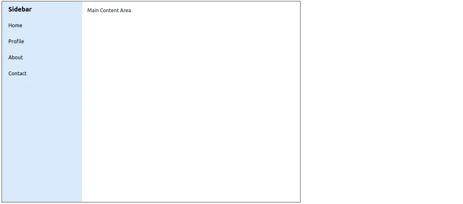
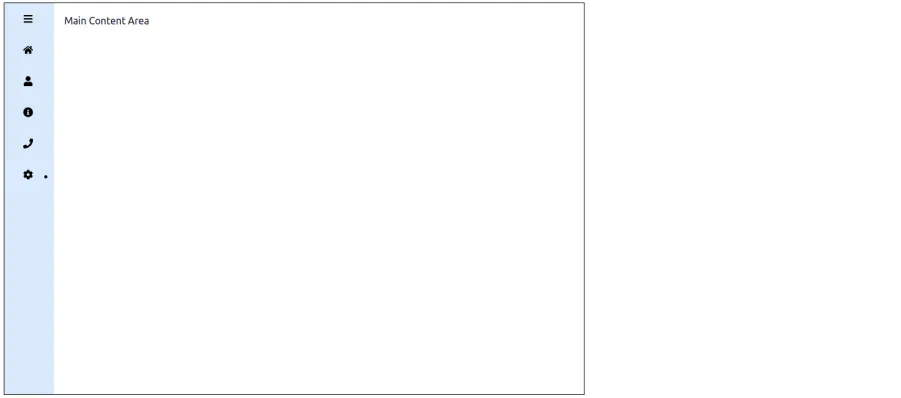
export default App;Sidebar state will look like this:
Sidebar with Icons -
Icons provide a visual representation of menu items, including dropdown menus, making it easier for users to recognise available options at a glance. For adding icons like the chevron icon in our project, we can use the react-icons or the material-ui icons library. In this, we are using the react-icons library to help you with the installation and usage of both, especially when working with a void callback function. Use the below command to install the react-icons library.
npm
npm i react-iconsyarn
yarn add react-iconsWe need to import the Sidebar, Menu, and MenuItem components from react-pro-sidebar along with icons from react-icons. The Menu and SubMenu components accept an icon prop, where we can also specify the sidebar RGB and pass a React icon.
SidebarComponent.jsx
import { Sidebar, Menu, MenuItem } from 'react-pro-sidebar';
import { Box, Typography } from '@mui/material';
import { FaUser, FaInfoCircle, FaPhone, FaHome } from 'react-icons/fa';


const SidebarComponent = () => {
 return (
   <Box sx={{ display: 'flex' }}>
     <Sidebar
       rootStyles={{
         height: '100vh',
         backgroundColor: '#90caf9',
         color: '#000',
       }}
     >
       <Menu       >
         <MenuItem>
           <Typography variant="h6" fontWeight="bold">
             Sidebar
           </Typography>
         </MenuItem>


         <MenuItem icon={<FaHome />}>Home</MenuItem>
         <MenuItem icon={<FaUser />}>Profile</MenuItem>
         <MenuItem icon={<FaInfoCircle />}>About</MenuItem>
         <MenuItem icon={<FaPhone />}>Contact</MenuItem>
       </Menu>
     </Sidebar>
   </Box>
 );
};

export default SidebarComponent;
Here’s how the sidebar with icons look:
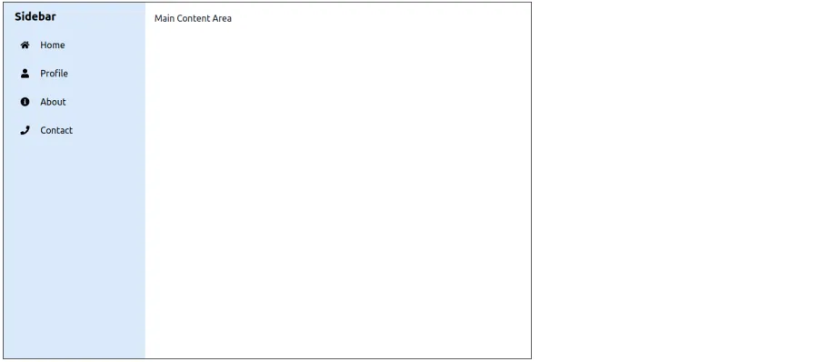
Sidebar with Submenus -
With react-pro-sidebar, you can also implement dropdown menus, submenus, and nested menus in your React app. We will import Sidebar, Menu, MenuItem, and SubMenu from the react-pro-sidebar library to override the breakpoint prop. You also need to set the submenu content and use it in SidebarComponent.jsx to manage sidebar state as shown below:

SidebarComponent.jsx
import { Sidebar, Menu, MenuItem, SubMenu } from 'react-pro-sidebar';
import { Box, Typography } from '@mui/material';
import { FaUser, FaInfoCircle, FaPhone, FaHome, FaCog,FaWrench,FaShieldAlt } from 'react-icons/fa';
const SidebarComponent = () => {
return (
<Box sx={{ display: 'flex' }}>
<Sidebar
rootStyles={{
height: '100vh',
backgroundColor: '#90caf9',
color: '#000',
}}
>
<Menu
>
<MenuItem>
<Typography variant="h6" fontWeight="bold">
Sidebar
</Typography>
</MenuItem>
<MenuItem icon={<FaHome />}>Home</MenuItem>
<MenuItem icon={<FaUser />}>Profile</MenuItem>
<MenuItem icon={<FaInfoCircle />}>About</MenuItem>
<MenuItem icon={<FaPhone />}>Contact</MenuItem>
<SubMenu label="Settings" icon={<FaCog />}>
<MenuItem icon={<FaWrench />} rootStyles={{backgroundColor:'#dbeafe'}}>
General
</MenuItem>
<MenuItem icon={<FaShieldAlt />} rootStyles={{backgroundColor:'#dbeafe'}}>
Security
</MenuItem>
</SubMenu>
</Menu>
</Sidebar>
</Box>
);
};
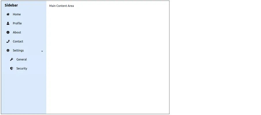
export default SidebarComponent;The following image displays the sidebar in the submenu state:
Sidebar with Collapsibility -
A collapsed sidebar is triggered by a toggle button or icon. Clicking the button expands the sidebar element to show its content, and clicking it again collapses it. We will implement this by creating a collapsed state using useState in the Sidebar component, as shown below.
SidebarComponent.jsx
import react from 'react';
import { Sidebar, Menu, MenuItem, SubMenu } from 'react-pro-sidebar';
import { Box, Typography } from '@mui/material';
import {
 FaUser,
 FaInfoCircle,
 FaPhone,
 FaHome,
 FaCog,
 FaWrench,
 FaShieldAlt,
 FaBars,
} from 'react-icons/fa';


const SidebarComponent = () => {
 const [collapsed, setCollapsed] = react.useState(false);


 return (
   <Box sx={{ display: 'flex' }}>
     <Sidebar
       rootStyles={{
         height: '100vh',
         backgroundColor: '#90caf9',
         color: '#000',
       }}
       collapsed={collapsed}
     >
       <Menu>
         <MenuItem icon={<FaBars />} onClick={() => setCollapsed(!collapsed)}>
           {!collapsed && (
             <Typography variant="h6" fontWeight="bold">
               Sidebar
             </Typography>
           )}
         </MenuItem>


         <MenuItem icon={<FaHome />}>Home</MenuItem>
         <MenuItem icon={<FaUser />}>Profile</MenuItem>
         <MenuItem icon={<FaInfoCircle />}>About</MenuItem>
         <MenuItem icon={<FaPhone />}>Contact</MenuItem>


         <SubMenu label="Settings" icon={<FaCog />}>
           <MenuItem
             icon={<FaWrench />}
             rootStyles={{ backgroundColor: '#dbeafe' }}
           >
             General
           </MenuItem>
           <MenuItem
             icon={<FaShieldAlt />}
             rootStyles={{ backgroundColor: '#dbeafe' }}
           >
             Security
           </MenuItem>
         </SubMenu>
       </Menu>
     </Sidebar>
   </Box>
 );
};

export default SidebarComponent;
This is how our application should appear in the sidebar collapsed state:
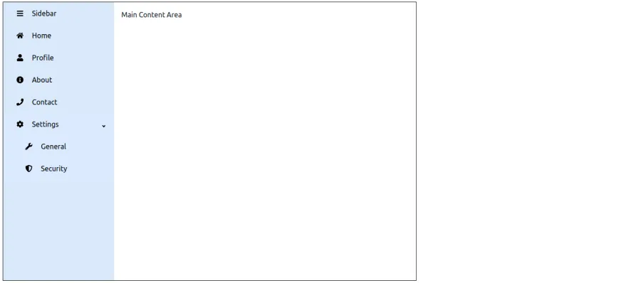
This is how it appears when we click on the "Sidebar" text to collapse the sidebar:
Top Navigation Libraries Preferred by Expert Developers!
Toggle Functionality for responsive sidebars menu
The sidebar in this example is collapsible, allowing users to toggle between an expanded and compact view. This helps improve the UX, especially on smaller screens.
We achieve this by managing a simple React state:
const [collapsed, setCollapsed] = React.useState(false);The toggle is implemented through the first MenuItem, using the hamburger icon:
<MenuItem icon={<FaBars />} onClick={() => setCollapsed(!collapsed)}>
  {!collapsed && "Sidebar"}
</MenuItem>
When collapsed, only icons are visible. When expanded, icons and labels are shown. This behavior is powered by react-pro-sidebar.
Sidebar Navigation with React Router
The purpose of a sidebar, especially when considering the sidebar's collapsed state, is to facilitate easy navigation. We can achieve this by integrating it with React-Router. To install and configure React-Router, use the following command:
npm
npm i react-router-domyarn
yarn add react-router-domFor detailed guidance on navigation in React, you can visit A Complete Guide on ReactJS Navigation
In the App.js component, we will import BrowserRouter, Routes, and Route from react-router-dom.
We will then create Home, Profile, About, Contact, and Settings pages to demonstrate React Router in action.
We wrap the SidebarComponent in the BrowserRouter, and then we will create route paths.
Setting up roots in App.jsx
import { BrowserRouter, Route, Routes } from 'react-router-dom';
import {
 Box,
} from '@mui/material';

import SidebarComponent from './components/SidebarComponent.jsx';
import Home from './components/Home';
import Profile from './components/Profile';
import Contact from './components/Contact';
import About from './components/About';
import General from './components/Settings/General';

import Security from './components/Settings/Security';


const App = () => {
 return (
   <BrowserRouter>
   <Box sx={{ display: 'flex', minHeight: '100vh' }}>
     <SidebarComponent />
     <Box
       component="main"
       sx={{
         flexGrow: 1,
         p:1,
         color: 'text.primary',
       }}
     >
      <Routes>
	   <Route path="/" element={<Home />} />
           <Route path="/profile" element={<Profile />} />
           <Route path="/about" element={<About />} />
           <Route path="/contact" element={<Contact />} />
           <Route path="/settings/general" element={<General />} />
           <Route path="/settings/security" element={<Security />} />
      </Routes>
     </Box>
   </Box>
   </BrowserRouter>
 );
};

export default App;
In SidebarComponent.jsx, we bring Link from react-router-dom and use it to link MenuItems.
Creating the sidebar with route links
SidebarComponent.jsx
import react from 'react';
import { Sidebar, Menu, MenuItem, SubMenu } from 'react-pro-sidebar';
import { Box, Typography } from '@mui/material';
import {
 FaUser,
 FaInfoCircle,
 FaPhone,
 FaHome,
 FaCog,
 FaWrench,
 FaShieldAlt,
 FaBars,
} from 'react-icons/fa';
import { Link } from 'react-router-dom';


const SidebarComponent = () => {
 const [collapsed, setCollapsed] = react.useState(false);


 return (
   <Box sx={{ display: 'flex' }}>
     <Sidebar
       rootStyles={{
         height: '100vh',
         backgroundColor: '#90caf9',
         color: '#000',
       }}
       collapsed={collapsed}
     >
       <Menu>
         <MenuItem icon={<FaBars />} onClick={() => setCollapsed(!collapsed)}>
           {!collapsed && (
             <Typography variant="h6" fontWeight="bold">
               Sidebar
             </Typography>
           )}
         </MenuItem>


         <MenuItem icon={<FaHome />} component={<Link to="/" />}>
           Home
         </MenuItem>
         <MenuItem icon={<FaUser />} component={<Link to="/profile" />}>
           Profile
         </MenuItem>
         <MenuItem icon={<FaInfoCircle />} component={<Link to="/about" />}>
           About
         </MenuItem>
         <MenuItem icon={<FaPhone />} component={<Link to="/contact" />}>
           Contact
         </MenuItem>


         <SubMenu label="Settings" icon={<FaCog />}>
           <MenuItem
             icon={<FaWrench />}
             rootStyles={{ backgroundColor: '#dbeafe' }}
             component={<Link to="/settings/general" />}
           >
             General
           </MenuItem>
           <MenuItem
             icon={<FaShieldAlt />}
             rootStyles={{ backgroundColor: '#dbeafe' }}
             component={<Link to="/settings/security" />}
           >
             Security
           </MenuItem>
         </SubMenu>
       </Menu>
     </Sidebar>
   </Box>
 );
};

export default SidebarComponent;
The following code snippets demonstrate the implementation of the Home and Profile components:
Sample Page Components
Home.jsx
import { Box, Typography } from "@mui/material";
const Home = () => {
return (
<Box sx={{ p: 2 }}>
<Typography
variant="h4"
fontWeight="bold"
mb={2}
>
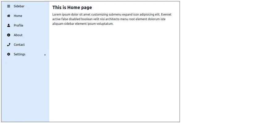
This is Home page
</Typography>
<Typography variant="body1">
Lorem ipsum dolor sit amet adipisicing elit. Eveniet active false
disabled boolean velit nisi architecto menu root element dolorum iste
aliquam ipsum voluptatum.
</Typography>
</Box>
);
};
export default Home;Profile.jsx
import { Box, Typography } from "@mui/material";
const Profile = () => {
return (
<Box sx={{ p: 2 }}>
<Typography
variant="h4"
fontWeight="bold"
mb={2}
>
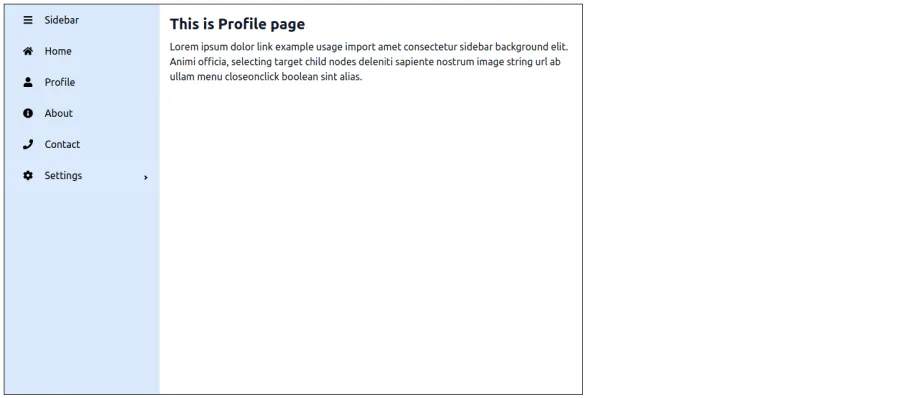
This is Profile page
</Typography>
<Typography variant="body1">
Lorem ipsum dolor link example usage import amet consectetur elit.
Animi officia, selecting target child nodes deleniti sapiente nostrum
ab ullam menu closeonclick boolean sint alias.
</Typography>
</Box>
);
};
export default Profile;Here’s how the home page looks with the navigation sidebar:
Here’s the profile page featuring a navigational sidebar:
Conclusion
The React Pro Sidebar library empowers developers to build elegant, responsive sidebars and highly functional side navigation menus with ease. Whether you need collapsible menus, nested submenus, or seamless integration with routing, including an active class, this library offers a robust set of features tailored for modern React applications.
From basic sidebars to complex, dynamic navigations tied to React-Router, React Pro Sidebar simplifies layout management and improves user experience. By combining it with tools like Tailwind CSS, React Icons, or MUI, you can apply transparency to create polished admin panels, dashboards, and internal tools while implementing a void callback function that scales with your project needs.
Mastering it means you're one step closer to building powerful, production-ready UIs in React, faster and cleaner.
FAQ's

Related articles

AI Integration in React Applications: Building Intelligent UIs with TensorFlow.js and Brain.js