Angular Elements Best Practices in 2024

Brief: This blog covers the best practices for using Angular Elements. You'll learn how to set up, configure, and use Angular components as custom elements outside Angular apps. This will also serve as a guide to step-by-step implementation and present real-world use cases of Angular applications, and will help developers to integrate Angular Elements seamlessly into modern, scalable, and cross-framework applications.
Table of Contents
Introduction
Implementation
Step 1: Installation
Step 2: Create the Component template
Step 3: Adding view and logic for Component
Step 4: Configure Angular Elements
Step 5: Use Angular Element Outside of Angular Application
Practical Applications of Angular Elements
Conclusion
Angular Elements is a feature introduced in the Angular framework. It allows Angular developers to create reusable components, that can be used outside of angular applications. It is also called a custom component or web component.
These components are encapsulated and self-contained, making them easy to integrate into any web application. You can use an Angular Element in any other application such as React, Vue.js, or plain HTML pages. Essentially, Angular Elements are normal components, which are packaged as Custom Elements. You can learn more about Custom Elements here.
Implementation
Step 1: Installation
Create a new angular project using Angular CLI
ng new angularElementOnce the angular application is created, change the directory to angularElement and install Angular Elements. For that, run an npm command, as shown below:
ng add @angular/elementsTo work with older browsers, we need polyfill. So, let us install that also as shown below:
npm install @webcomponents/custom-elementsAfter installing polyfill, open the polyfills.ts file and add these two entries:
import '@webcomponents/custom-elements/src/native-shim';
import '@webcomponents/custom-elements/custom-elements.min';
Step 2: Create the Component template
Create an angular component using Angular CLI
ng generate component calculatorElementThis component will be exposed as a Custom element
Step 3: Adding view and logic for Component
First, we add some calculator logic and @input and @output decorators in our component file. i.e. src\app\calculator-element\calculator-element.component.ts
import { Component, EventEmitter, Input, Output } from '@angular/core';

@Component({
  selector: 'app-calculator-element',
  templateUrl: './calculator-element.component.html',
  styleUrls: ['./calculator-element.component.scss']
})
export class CalculatorElementComponent {
  @Input() widgetInput = 'Angular Calculator Component';
  @Output() widgetOutput = new EventEmitter<number>();

  number1 = 0;
  number2 = 0;

  add(): void {
    this.widgetOutput.emit(this.number1 + this.number2);
  }

  subtract(): void {
    this.widgetOutput.emit(this.number1 - this.number2);
  }

  multiply(): void {
    this.widgetOutput.emit(this.number1 * this.number2);
  }

  divide(): void {
    this.widgetOutput.emit(this.number1 / this.number2);
  }
}
In the above code, we added widgetInput for displaying the title and widgetOutput for emitting the result using decorators. also, we define 2 variables for bind input values and 4 simple calculation-based functions that can emit the result.
Now, we will add code for the HTML view for the temple in src\app\calculator-element\calculator-element.component.html
<p>
  {{ widgetInput }}
</p>
<div class="row">
  <input type="number" [(ngModel)]="number1" />
  <input type="number" [(ngModel)]="number2" />
</div>
<div class="row">
  <button (click)="add()">Add</button>
  <button (click)="subtract()">Subtract</button>
  <button (click)="multiply()">Multiply</button>
  <button (click)="divide()">Divide</button>
</div>
Here, we added 4 buttons which will trigger the functions and 2 input boxes. also, we are displaying the title which one will be getting from outside of the component using string interpolation.
Similarly, we will add some SCSS for a better look at the View. in file src\app\calculator-element\calculator-element.component.scss
p {
  font-family: Lato;
  font-weight: 700;
  font-size: xx-large;
}

input {
  font-family: Lato;
  font-weight: 700;
  font-size: large;
  margin: {
    right: 1rem;
  };
}

button {
  font-family: Lato;
  font-weight: 700;
  font-size: large;
  margin: {
    right: 1rem;
  };
}

.row {
  margin: {
    bottom: 1rem;
  }
}
Step 4: Configure Angular Elements
Now, we will modify the app.module.ts file to configure Angular Elements to convert the component into an Angular Element.
import { ApplicationRef, DoBootstrap, Injector, NgModule } from '@angular/core';
import { BrowserModule } from '@angular/platform-browser';
import { AppComponent } from './app.component';
import { CalculatorElementComponent } from './calculator-element/calculator-element.component';
import { FormsModule } from '@angular/forms';
import { createCustomElement } from '@angular/elements';

@NgModule({
  declarations: [
    AppComponent,
    CalculatorElementComponent
  ],
  imports: [
    BrowserModule,
    FormsModule
  ],
  providers: [],
  bootstrap: []
})
export class AppModule implements DoBootstrap {

  constructor(private injector: Injector) {}

  ngDoBootstrap(appRef: ApplicationRef) {
    const calculatorWidget = createCustomElement(CalculatorElementComponent, {
      injector: this.injector
    });
    customElements.define('calculator-widget', calculatorWidget);
  }

 }
In the above code, We first import FormsModule because we want to bind input fields with the component fields. Also removed AppComponent from the bootstrap array because AppComponent is the root component of the angular app and here we want to do custom bootstrapping. Also, we implement the DoBootstrap interface for bootstrapping for that we inject the injector into the constructor. Injectors are needed to create custom elements.
Now in the ngDoBootstrap method, we create a custom element by calling createCustomElement by providing CalculatorElementComponent and injector as parameters and we store the constructor as a result in calculatorWidget field. after that, we register the constructor in the custom element registry by using customElements.define() method . The first parameter will be the name of the custom element which we can use as a tag name to access the element and the second parameter will be the constructor which is stored in the calculatorWidget field.
Looking for something easy to integrate into any web application?
With Angular Minds’ best practices in Angular Development, witness significant improvement in your next web development project.
Step 5: Use Angular Element Outside of Angular Application
Here we are going to use angular element with plane HTML file using javascript. First, we need to build our angular element application. let's build the angular application using Angular CLI
ng build The above command will compile the code and generate files as shown below in the ".dist" folder.
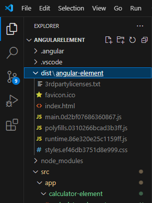
Now we will create a new File outside of the Angular Application. Also, copy this main.js, polyfills.js, and runtime.js file into that folder. rename these files after copying them into a new folder(remove encrypt code).
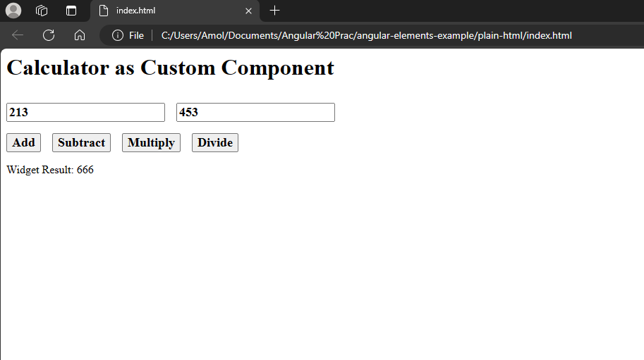
Will create a plain HTML file (index.html) in the new folder. and add the code shown below.
<html>
  <head>
    <link rel="stylesheet" href="styles.css">
    <script src="./polyfills.js"></script>
    <script src="./runtime.js"></script>
    <script src="./main.js"></script>
  </head>
  <body>
    <calculator-widget id="widget" widget-input="Calculator as Custom Component"></calculator-widget>
    <script>
      document.getElementById('widget').addEventListener('widgetOutput', function (e) {
        document.getElementById('widgetResult').innerHTML = 'Widget Result: ' + e.detail;
      })
    </script>
    <div id="widgetResult"></div>
  </body>
</html>
Here, we just added main.js, polyfills.js, and runtime.js in the head section for the Angular element.
After that, we added our custom element <calculator-widget> into a body section. by setting the value for the widget-input attribute we are setting a new title of the Anguler element using @input decorator.
Also, we set the id for our custom element <calculator-widget> to use events and properties in plain Javascript. In the Script tag, we added code to listen to events and display the generated output on the same plain HTML page. here we display output in <div id="widgetResult"></div> tag.
Practical Applications of Angular Elements
Legacy Systems Integration: Angular Elements allows developers to slowly update/migrate outdated systems by letting developers integrate Angular components into current applications.
Micro Frontends: In a micro-frontend architecture, Angular Elements allows teams to independently develop and deploy UI components, and maintain modularity and scalability.
Hybrid Applications: Angular Elements facilitate the development of hybrid applications where Angular components coexist with components from other frameworks, providing a unified user experience.
Third-party Integration: Developers can create reusable Angular components as custom elements for third-party consumption, extending the reach of their libraries and frameworks.
On the note of conclusion
Angular Elements represent a significant advancement in Angular's capabilities, opening up new avenues for interoperability and code reuse in web development. By packaging Angular components as custom elements, developers can seamlessly integrate Angular functionality into applications built with other frameworks or plain HTML pages.
Whether it's migrating legacy systems, embracing micro frontends, or enhancing third-party integration, Angular Elements empowers developers to build modular, scalable, and interoperable web applications. As the web development landscape continues to evolve, Angular Elements serve as a powerful tool for bridging the gap between Angular and other ecosystems, driving innovation and collaboration in the developer community.
FAQ's

Related articles