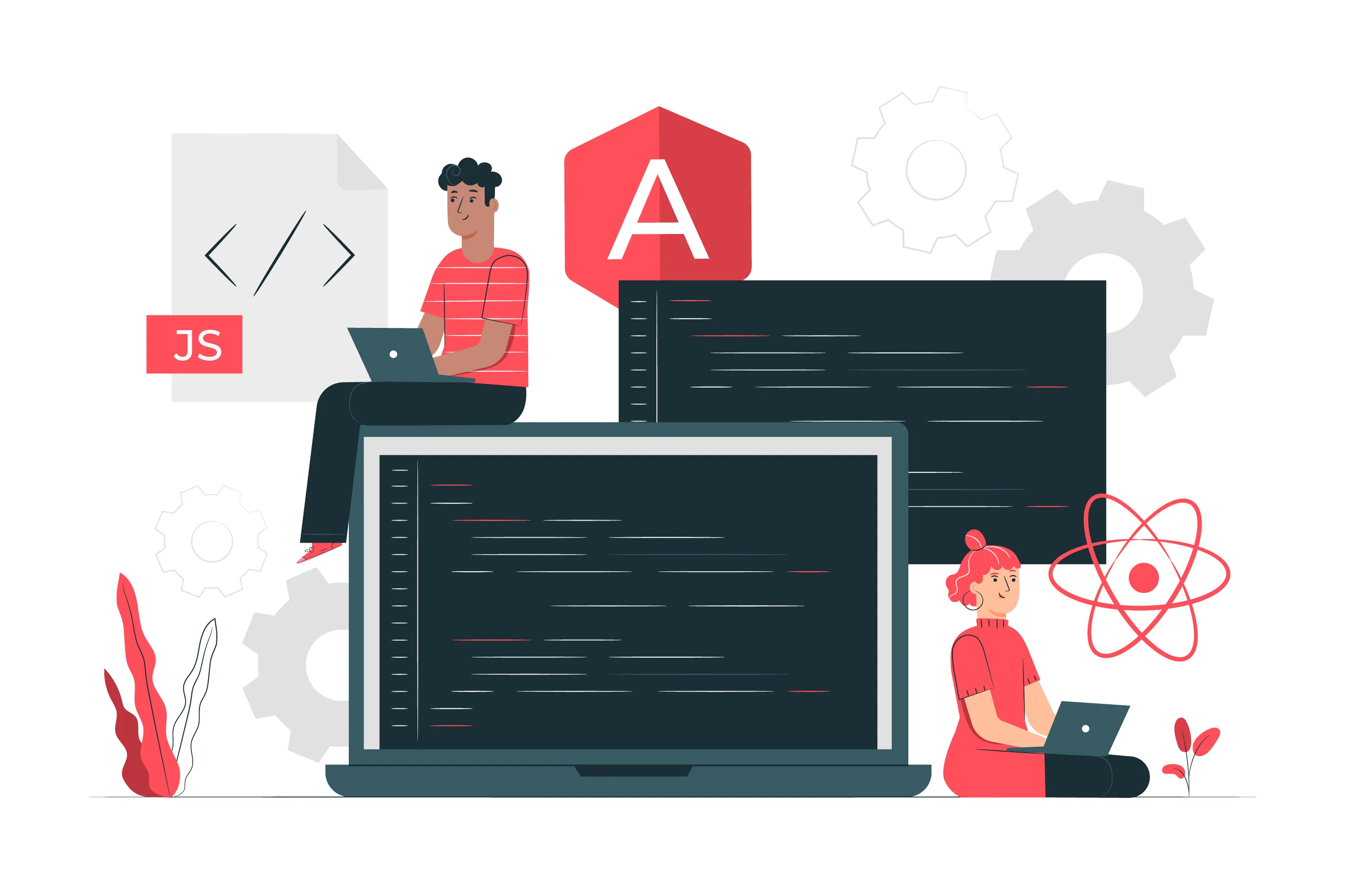
Top 14 Angular Libraries in 2025 You Don't Want to Miss
Explore the top 14 Angular libraries you should know in 2025 to build powerful, responsive, and modern web applications. This guide dives into popular UI frameworks like Angular Material, PrimeNG, NG Bootstrap, and more. Learn each library’s use cases and start building your Angular component library.
Top Angular UI Libraries For 2025
In the development process of AngularJS apps, we often have to choose between creating new modules or components in interactive web applications that only appear once or twice. Developers spend the majority of their time on features that are critical to the principal goal of web applications and are sometimes dependent on them.
What is an Angular Library?
An Angular Library is a predetermined set of modules, components, directives, or pipelines that someone created for their own and others' use. Developers incorporate these libraries into their Angular apps to accelerate web development. Libraries may contain CSS modules, other prefabricated components, or anything else that aids development.
As web applications get on the desk for development some basic libraries are mostly used in applications.
List of Top Best Angular Component Libraries
1. NGX Bootstrap
2. Prime NG
3. Angular Material
4. NG Bootstrap
5. Clarity
6. Fuel-UI
7. NG Semantic-UI
8. Onsen UI
9. NG Lightning
10. NG-ZORRO
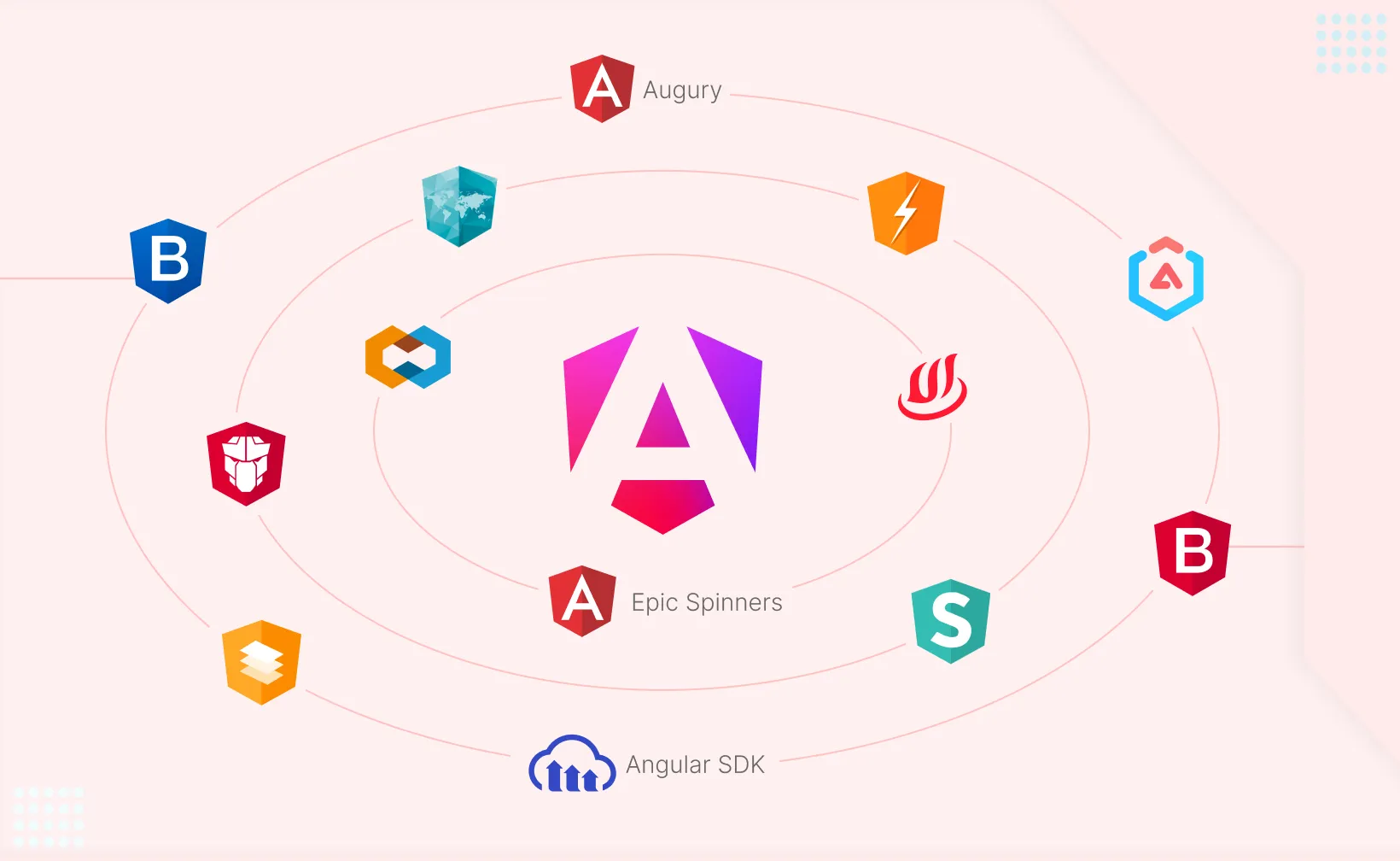
11. Angular Google Maps
12. Cloudinary Angular SDK
13. Augury
14. Angular Epic Spinners
1. NGX Bootstrap

Ngx-bootstrap is an open-source component library of Angular. It provides multiple components of Bootstrap. Using this library, users can easily style bootstrap components. Unlike directly using Bootstrap’s JavaScript code, ngx-bootstrap wraps Bootstrap components as Angular components for smoother and seamless integration.
Steps to Use NGX Bootstrap:
Step 1: Install NGX Bootstrap and Bootstrap
To get started, you need to install NGX Bootstrap along with Bootstrap. Run the following command to install them via npm:
npm install ngx-bootstrap bootstrap --saveThis command installs both the NGX Bootstrap library and the Bootstrap CSS styles.
Step 2: Import Components and Add Styles
Next, you need to import the necessary Bootstrap components into your Angular module.
For example, to use the Alert component:
Import AlertModule in app.module.ts:
import { AlertModule } from 'ngx-bootstrap';

@NgModule({
  imports: [
    AlertModule.forRoot(),  // Initialize the Alert module
    ...
  ],
  ...
})
export class AppModule {}
Include Bootstrap and Animate.css in the angular.json file to load the required styles for Bootstrap components:
"styles": [
  "src/styles.scss",
  "node_modules/animate.css/animate.min.css",
  "node_modules/bootstrap/dist/css/bootstrap.min.css"
]
This ensures that Bootstrap’s styles are included globally in your Angular application.
Step 3: Add Alert in the Template
Now, to display a Bootstrap Alert component in your application, add the following code in your app.component.html:
<alert type="success">Welcome To ngx-bootstrap</alert>
This creates a success alert with the message "Welcome To ngx-bootstrap". You can change the type to other values such as info, warning, danger, etc., depending on the type of alert you want to display.
Key Takeaways:
Install NGX Bootstrap and Bootstrap using npm.
Import the required Bootstrap components, like AlertModule, in app.module.ts.
Include Bootstrap's CSS in the angular.json file.
Use the components (like the Alert) in your templates by adding the appropriate HTML tags.
With this setup, you can use Bootstrap components in your Angular project with seamless integration, enhanced performance, and no need for jQuery.
2. PrimeNG

Angular PrimeNG is a free framework that includes several ready-to-use Angular UI components. It allows you to simply construct elegant, responsive and high performance websites. PrimeNG makes it easier to work with numerous UI components, such as panels, overlays, menus, and charts.
Consider having a collection of tools in one box that allows effortless web development. That is PrimeNG for Angular. It simplifies the process of building user interfaces by including a large number of components. Whether you want to easily integrate interactive forms, show data in tables, or visualize complex data with charts, PrimeNG has you covered. It's not just about convenience; it's about making Angular development fun and efficient.
Steps to Use PrimeNG:
Installation:
Bash
npm install primeng primeicons --saveThis installs both PrimeNG and PrimeIcons (icon library).
Module Imports:
Import specific PrimeNG modules for the components you need (e.g., ButtonModule, TableModule) in your app.module.ts:
TypeScript
import { ButtonModule } from 'primeng/button';
import { TableModule } from 'primeng/table';

@NgModule({
  imports: [
    ButtonModule,
    TableModule,
    // ... other imports
  ],
  // ...
})
export class AppModule { }
CSS and Themes:
Include PrimeNG's CSS and theme in your angular.json file for styling:
JSON
"styles": [
  "src/styles.scss",
  "node_modules/primeng/resources/primeng.min.css",
  "node_modules/primeng/resources/themes/lara-light-indigo/theme.css",
  "node_modules/primeicons/primeicons.css"
]
This applies the default theme and includes PrimeIcons.
Using Components in Templates:
Use PrimeNG components directly in your Angular component templates:
HTML
<button pButton type="button" label="Click Me"></button>

<p-table [value]="data">
  <ng-template pTemplate="header">
    <tr>
      <th>Name</th>
      <th>Age</th>
    </tr>
  </ng-template>
  <ng-template pTemplate="body" let-rowData>
    <tr>
      <td>{{rowData.name}}</td>
      <td>{{rowData.age}}</td>
    </tr>
  </ng-template>
</p-table>
The pButton directive adds PrimeNG's styling and functionality to the button. The p-table component displays data from the data array defined in your component class (e.g., app.component.ts).
Key Takeaways:
Install PrimeNG and PrimeIcons.
Import specific PrimeNG modules in app.module.ts.
Include PrimeNG CSS and themes in angular.json.
Use PrimeNG components with their designated directives in templates.
With its extensive component library and customization options, PrimeNG is a powerful tool for building feature-rich Angular applications.
3. Angular-material

Angular Material is one of the UI-based Angular component libraries that provides a theme full of components for applications. These components are developed to make components reusable and tested.
Why Angular-material?
Well-developed components with common interaction patterns and proper testing. Angular material design provides UI components from the component library that are useful for basic tasks of Angular applications. Also, provides tools, allowing developers to build their own custom components with common patterns of user interactions.
Let’s see how we can use Angular material
Steps to Use Angular Material:
Installation:
Bash
npm install @angular/material @angular/cdk @angular/animationsInstalls Material, the Component Development Kit (CDK), and the animations module.
Theme Setup (Recommended Approach):
Instead of directly including a pre-built theme in angular.json, it's better to use the theming system within your styles.scss (or styles.css) file. This provides more flexibility.
SCSS
@import '~@angular/material/prebuilt-themes/indigo-pink.css'; // Or any other theme
//OR For more customization use the following
@import '~@angular/material/theming';
@include mat-core();
$my-primary: mat-palette($mat-indigo);
$my-accent: mat-palette($mat-pink, A200, A100, A400);
$my-warn: mat-palette($mat-red);
$my-theme: mat-light-theme($my-primary, $my-accent, $my-warn);
@include angular-material-theme($my-theme);
angular.json styles: "styles": ["src/styles.scss"] (Only your main style file).
Import Material Modules:
Import only the necessary modules in your app.module.ts:
TypeScript
import { NgModule } from '@angular/core';
import { BrowserModule } from '@angular/platform-browser';
import { MatButtonModule } from '@angular/material/button';
import { MatInputModule } from '@angular/material/input';
import { MatFormFieldModule } from '@angular/material/form-field';
import { BrowserAnimationsModule } from '@angular/platform-browser/animations'; // Crucial for animations
import { AppComponent } from './app.component';

@NgModule({
  declarations: [AppComponent],
  imports: [
    BrowserModule,
    MatButtonModule,
    MatInputModule,
    MatFormFieldModule,
    BrowserAnimationsModule
  ],
  providers: [],
  bootstrap: [AppComponent]
})
export class AppModule { }
Using Components:
Button (app.component.html):
HTML
<button mat-button>Click Me</button>
<button mat-raised-button color="primary">Primary</button>
Input Field (app.component.html):
HTML
<mat-form-field appearance="fill">
  <mat-label>Enter your name</mat-label>
  <input matInput placeholder="Ex. John Doe">
</mat-form-field>
As an Angular-material for angular means angular from 2.0 to onwards like this for AngularJs or Angular JS 1.0 version there is an angularJs-material library [https://material.angularjs.org/latest].
Key Takeaways:
Install Angular Material and its dependencies (@angular/material, @angular/cdk, @angular/animations).
Include a Material Design theme in your angular.json file to style the components.
Import Angular Material modules like MatButtonModule, MatInputModule, etc., in app.module.ts.
Use Angular Material components like buttons and input fields in your templates by using directives like mat-button and matInput.
4. NG Bootstrap
NG Bootstrap is an Angular library that brings Bootstrap components (like modals, alerts, dropdowns, etc.) to Angular without the dependency on jQuery. It enables Angular developers to use Bootstrap's responsive and customizable components seamlessly within their Angular applications, while also ensuring better performance and no reliance on jQuery.
Steps to Use NG Bootstrap:
Installation:
Bash
npm install @ng-bootstrap/ng-bootstrap bootstrap --saveThis installs NG Bootstrap components and the Bootstrap CSS framework.
Include Bootstrap CSS:
In your angular.json file, update the styles array to include Bootstrap CSS:
JSON
"styles": [
  "src/styles.scss",
  "node_modules/bootstrap/dist/css/bootstrap.min.css"
]
Import NG Bootstrap Modules:
Import only the required NG Bootstrap modules in your app.module.ts:
TypeScript
import { NgModule } from '@angular/core';
import { BrowserModule } from '@angular/platform-browser';
import { NgbModule } from '@ng-bootstrap/ng-bootstrap'; // Import for all Bootstrap components
// OR
// import { NgbModalModule } from '@ng-bootstrap/ng-bootstrap'; // Import only ModalModule if that's all you need

// ... other imports

@NgModule({
  // ...
})
export class AppModule { }
Using NG Bootstrap Components:
Example: Modal Component:
(i) app.component.ts:
TypeScript
import { Component } from '@angular/core';
import { NgbModal } from '@ng-bootstrap/ng-bootstrap';

@Component({
  // ...
})
export class AppComponent {
  constructor(private modalService: NgbModal) {}

  openModal() {
    const modalRef = this.modalService.open(content); // Open the modal
    // Handle modal events (optional)
  }
}
(ii) app.component.html:
HTML
<button class="btn btn-primary" (click)="openModal()">Open Modal</button>

<ng-template #content let-modal>
  </ng-template>
Customization (Optional):
NG Bootstrap components offer customization options. Refer to the NG Bootstrap documentation for details.
Key Takeaways:
Concise module imports (import only what you need).
Clear separation between component logic (app.component.ts) and template (app.component.html).
Highlighted the optional nature of customization.
5. Clarity
Clarity is a design system which is developed by VMware for building modern web applications. It includes a set of reusable UI components and guidelines for building consistent, accessible, and scalable applications. Clarity’s core components are built using Angular, and it focuses on providing a clean, consistent user experience that adheres to best practices in accessibility and responsive design.
Steps to Use Clarity:
Installation:
Bash
npm install @clr/angular @clr/uiInstalls the Angular components and the core Clarity styles and assets.
Include Clarity Styles and Icons:
The recommended way to include Clarity styles is in your angular.json file. Include both the UI styles and the icons (if needed):
JSON
"styles": [
  "src/styles.scss", // Your main styles
  "node_modules/@clr/ui/clr-ui.min.css",
  "node_modules/@clr/icons/clr-icons.min.css" // Include this if using icons
]
Import Clarity Modules:
Import the ClarityModule in your app.module.ts:
TypeScript
import { NgModule } from '@angular/core';
import { BrowserModule } from '@angular/platform-browser';
import { ClarityModule } from '@clr/angular';
import { BrowserAnimationsModule } from '@angular/platform-browser/animations'; // Important for animations
import { AppComponent } from './app.component';

@NgModule({
  declarations: [AppComponent],
  imports: [
    BrowserModule,
    ClarityModule,
    BrowserAnimationsModule // Add BrowserAnimationsModule
  ],
  providers: [],
  bootstrap: [AppComponent]
})
export class AppModule { }
Key Improvement: Added BrowserAnimationsModule. While some basic Clarity components work without it, many advanced components and features rely on Angular animations. It's best to include it from the start to avoid issues later.
Using Clarity Components:
Button (app.component.html):
HTML
<button class="btn btn-primary">Click Me!</button>Clarity uses standard Bootstrap-like classes for basic styling (e.g., btn btn-primary).
Alert (app.component.html):
HTML
<clr-alert [clrAlertType]="'success'" [clrCloseable]="false">
  Your changes have been saved successfully!
</clr-alert>
<clr-alert [clrAlertType]="'warning'" [clrCloseable]="true">
  Be careful!
</clr-alert>
Note the use of [clrCloseable] to make the alert dismissible.
Icon (app.component.html):
HTML
<clr-icon shape="check-circle"></clr-icon>
<clr-icon shape="exclamation-triangle" class="is-solid"></clr-icon>
Use the clr-icon component with the shape attribute. The is-solid class makes the icon filled.
Key Takeaways:
npm install @clr/angular @clr/ui to install Clarity components and styles.
Add Clarity UI and icons to angular.json for styling.
Import ClarityModule and BrowserAnimationsModule in app.module.ts.
Use Clarity components like <button>, <clr-alert>, and <clr-icon> in templates.
Style components with classes like btn-primary and is-solid for icons.
6. Fuel-UI

Fuel-UI is a lightweight, easy-to-use UI component library designed for Angular applications. It provides a set of simple, minimalist, and clean components to build modern web apps quickly and with minimal effort. Fuel-UI is not as feature-rich as some of many component libraries in the larger libraries, but it is an excellent choice for developers who prefer simplicity and minimalism in their designs.
Steps to Use Fuel-UI:
Installation:
To get started with Fuel-UI in your Angular project, you need to install the library via npm:Bash
npm install fuel-uiImport Fuel-UI Module:
Once the library is installed, you must import the required components into your Angular application.
Open app.module.ts and import the Fuel-UI module
TypeScript
import { NgModule } from '@angular/core';
import { BrowserModule } from '@angular/platform-browser';
import { FuelUiModule } from 'fuel-ui';
import { AppComponent } from './app.component';

@NgModule({
  declarations: [AppComponent],
  imports: [
    BrowserModule,
    FuelUiModule // Import the Fuel-UI module
  ],
  providers: [],
  bootstrap: [AppComponent]
})
export class AppModule { }
Using Fuel-UI Components:
Fuel-UI provides a number of basic UI components, such as buttons, form controls, and layout components. You can start using these components in your templates.
Button (app.component.html):
HTML
<button fuel-button>Click Me!</button>Input (app.component.html):
HTML
<fuel-input placeholder="Enter your name"></fuel-input>
Custom Styling (Optional):
Fuel-UI offers a simple and clean set of styles by default, you can easily customize the appearance of the components by overriding the styles in your own styles.scss or app.component.css.
SCSS
fuel-button {
  background-color: #007bff; // Example customization
  color: white;
}
Key Takeaways:
Install Fuel-UI via npm using the command: npm install fuel-ui --save.
Import Fuel-UI module in app.module.ts to use Fuel-UI components.
Use Fuel-UI components like fuel-button, fuel-input, etc., in your templates.
Customize styling as needed by overriding the default styles in your CSS.
7. NG Semantic-UI
NG Semantic-UI is an Angular wrapper for the Semantic UI framework, offering a set of responsive UI components and features designed to build modern and clean web applications. It integrates Semantic UI's powerful features into Angular, making it easier to use in Angular projects without manually managing dependencies.
Steps to Use NG Semantic-UI:
Installation:
Bash
npm install ng-semantic-ui semantic-ui-cssIt is important to install semantic-ui-css as it is a peer dependency of ng-semantic-ui
Import Required Modules:
Import the necessary modules in your app.module.ts. It's generally recommended to import the SuiModule which includes all components.
TypeScript
import { NgModule } from '@angular/core';
import { BrowserModule } from '@angular/platform-browser';
import { SuiModule } from 'ng-semantic-ui'; // Import the main module
import { AppComponent } from './app.component';

@NgModule({
  declarations: [AppComponent],
  imports: [
    BrowserModule,
    SuiModule // Imports all components
  ],
  providers: [],
  bootstrap: [AppComponent]
})
export class AppModule { }
Add Semantic UI Styles:
The recommended approach is to import the CSS in your src/styles.scss (or styles.css) file:
SCSS
@import '~semantic-ui-css/semantic.min.css';Then in your angular.json styles array, you should have
JSON
"styles": [
    "src/styles.scss"
],
Use NG Semantic-UI Components:
Use the components in your templates:
Button (app.component.html):
HTML
<button sui-button class="primary">Click Me</button>Note the use of sui-button instead of semantic-button
Accordion (app.component.html):
HTML
<div class="ui styled fluid accordion">
  <div class="title">
    <i class="dropdown icon"></i>
    What is a dog?
  </div>
  <div class="content">
    <p>A dog is a domesticated carnivorous mammal that typically has a long snout, an acute sense of smell, and a barking, howling, or whining voice.</p>
  </div>
  <div class="title">
    <i class="dropdown icon"></i>
    What kinds of dogs are there?
  </div>
  <div class="content">
    <p>There are many breeds of dogs.</p>
  </div>
</div>
Note that you use standard Semantic UI markup for the accordion, not custom Angular tags.
5. Custom Styling (Optional)
You can further customize the components by overriding the default styles.
Example: Customizing Button
css
semantic-button {
  background-color: #ff6347;  /* Custom background color */
  color: white;               /* Custom text color */
}
Key Takeaways:
Install NG Semantic-UI via npm: npm install ng-semantic-ui --save.
Import components like AccordionModule or ButtonModule into app.module.ts.
Add Semantic UI CSS in angular.json to apply styles.
Use components like buttons, accordions, etc., in your Angular templates.
Customize the styles as needed with your own CSS.
8. Onsen UI

Onsen UI is a framework specifically designed for building hybrid mobile apps with Angular. It provides UI components optimized for mobile devices, offering native-like gestures, transitions, and performance.
Steps to Use Onsen UI:
Installation:
Bash
npm install onsenui @angular/onsenuiImport Onsen UI Module:
Import the OnsenModule in your app.module.ts:
TypeScript
import { NgModule } from '@angular/core';
import { BrowserModule } from '@angular/platform-browser';
import { OnsenModule } from '@angular/onsenui';
import { AppComponent } from './app.component';

@NgModule({
  declarations: [AppComponent],
  imports: [
    BrowserModule,
    OnsenModule // Import Onsen UI module
  ],
  providers: [],
  bootstrap: [AppComponent]
})
export class AppModule { }
Add Onsen UI Styles:
The recommended approach is to import the CSS in your src/styles.scss (or styles.css) file:
SCSS
@import '~onsenui/css/onsenui.css';
@import '~onsenui/css/onsen-css-components.css';
Then, in your angular.json file, the styles array should only contain the path to your main style file:
JSON
"styles": [
  "src/styles.scss"
]
This is better for build optimization and maintainability.
Using Onsen UI Components:
Use Onsen UI components in your templates:
Button (app.component.html):
HTML
<ons-button (click)="showMessage()">Click Me</ons-button>Tabbar (app.component.html):
HTML
<ons-tabbar swipeable>
  <ons-tab label="Home" icon="ion-home" active>
    <ng-template>
      <h1>Home</h1>
    </ng-template>
  </ons-tab>

  <ons-tab label="Settings" icon="ion-settings">
    <ng-template>
      <h1>Settings</h1>
    </ng-template>
  </ons-tab>
</ons-tabbar>
Using the active attribute on the first ons-tab is the correct way to set the initial selected tab.
5. Customize Styling (Optional)
You can customize Onsen UI components by overriding the default styles in your CSS or SCSS files.
Example: Customizing Button Style
css
ons-button {
  background-color: #007bff;
  color: white;
}
Key Takeaways:
Install Onsen UI: npm install onsenui @angular/onsenui --save.
Import Onsen UI module in app.module.ts.
Add Onsen UI styles in angular.json.
Use Onsen UI components like ons-button, ons-tabbar, etc., in your templates.
Customize the components by overriding default styles if needed.
9. NG Lightning

NG Lightning is an Angular component library that brings the Salesforce Lightning Design System (SLDS) to Angular applications. It allows developers to create enterprise-level applications with components that match the Salesforce Lightning design, providing a professional and consistent UI that adheres to Salesforce’s design principles.
Steps to Use NG Lightning
1. Installation
To get started, install NG Lightning via npm:
npm install ng-lightning --save2. Import NG Lightning Module
After installation, import the necessary modules into your app.module.ts. For example, to use a Button component:
import { NgModule } from '@angular/core';
import { BrowserModule } from '@angular/platform-browser';
import { NgLightningModule } from 'ng-lightning';
import { AppComponent } from './app.component';

@NgModule({
  declarations: [AppComponent],
  imports: [
    BrowserModule,
    NgLightningModule // Import NG Lightning module
  ],
  providers: [],
  bootstrap: [AppComponent]
})
export class AppModule {}
3. Add SLDS Styles
Since NG Lightning is based on the Salesforce Lightning Design System (SLDS), you need to add the SLDS CSS to your angular.json file:
"styles": [
  "src/styles.css",
  "node_modules/@salesforce-ux/design-system/assets/styles/salesforce-lightning-design-system.min.css"
]
This step ensures that all SLDS-based components are styled correctly.
4. Use NG Lightning Components
Now that everything is set up, you can use NG Lightning components in your templates.
Example 1: Using Button Component
<ng-lightning-button label="Click Me" variant="brand"></ng-lightning-button>This renders a button styled according to Salesforce's Lightning and material design guidelines.
Example 2: Using Card Component
<ng-lightning-card header="Card Header" footer="Card Footer">
  <p>This is an example card component using NG Lightning.</p>
</ng-lightning-card>
5. Customize Styling (Optional)
You can easily customize the components by overriding the default SLDS styles in your own CSS files.
ng-lightning-button {
  background-color: #ff9800; /* Example of custom background color */
}
Key Takeaways:
Install NG Lightning using npm: npm install ng-lightning --save.
Import the NG Lightning module into your app.module.ts.
Add SLDS styles to angular.json to apply the Salesforce design system.
Use components like <ng-lightning-button>, <ng-lightning-card>, etc., in your templates.
Customize the components by overriding the default styles.
10. NG-ZORRO

NG-ZORRO is an Angular UI component library based on Ant Design, a popular design system used for enterprise applications. NG-ZORRO offers a wide range of high-quality UI components such as tables, forms, buttons, and modals, with a clean, professional design and full support for internationalization.
Steps to Use NG-ZORRO
1. Installation
To get started, you need to install NG-ZORRO and the Ant Design styles:
npm install ng-zorro-antd --saveYou also need to install the required Angular animations package:
npm install @angular/animations --save2. Import NG-ZORRO Module
In your app.module.ts, import only the components necessary NG-ZORRO components. For example, to use the Button and Icon components:
import { NgModule } from '@angular/core';
import { BrowserModule } from '@angular/platform-browser';
import { BrowserAnimationsModule } from '@angular/platform-browser/animations';
import { NzButtonModule } from 'ng-zorro-antd/button';
import { NzIconModule } from 'ng-zorro-antd/icon';
import { AppComponent } from './app.component';

@NgModule({
  declarations: [AppComponent],
  imports: [
    BrowserModule,
    BrowserAnimationsModule,  // Required for animations
    NzButtonModule,           // Import Button module
    NzIconModule              // Import Icon module
  ],
  providers: [],
  bootstrap: [AppComponent]
})
export class AppModule {}
3. Add NG-ZORRO Styles
To apply NG-ZORRO styles, add the NG-ZORRO CSS in the angular.json file under the styles array:
"styles": [
  "src/styles.css",
  "node_modules/ng-zorro-antd/ng-zorro-antd.min.css"
]
This ensures that all NG-ZORRO components are styled correctly.
4. Use NG-ZORRO Components
Once setup is complete, you can use NG-ZORRO components in your templates.
Example 1: Using Button Component
<button nz-button nzType="primary">Primary Button</button>This renders a styled primary button using NG-ZORRO.
Example 2: Using Icon Component
<i nz-icon nzType="home"></i>This renders a home icon using NG-ZORRO's icon library.
5. Customize Styling (Optional)
You can customize the default NG-ZORRO styles by overriding them in your CSS or SCSS files.
Example: Customizing Button Style
nz-button {
  background-color: #ff5722; /* Custom background color */
  color: white;              /* Custom text color */
}
Key Takeaways:
Install NG-ZORRO and the required packages: npm install ng-zorro-antd --save.
Import NG-ZORRO modules like NzButtonModule and NzIconModule into app.module.ts.
Add NG-ZORRO CSS in angular.json.
Use components like <button nz-button>, <i nz-icon>, etc., in your templates.
Customize the components by overriding styles as needed.
Key Differences from General-Purpose UI Libraries:
These libraries - Angular Google Maps, Cloudinary Angular SDK, Augury, and Angular Epic Spinners are specialized tools that focus on adding specific functionalities to Angular applications, as opposed to general-purpose UI libraries like Angular Material or PrimeNG, which provide a wide range of standard UI components for building general user interfaces (buttons, forms, cards, etc.).
Angular Google Maps is for integrating maps, while UI libraries provide components for general interface elements.
Cloudinary Angular SDK handles media management, whereas UI libraries focus on form elements, navigation bars, etc.
Augury is a tool for debugging and profiling Angular apps, not for rendering UI elements.
Angular Epic Spinners provides only loading indicators, which is a very specific component compared to comprehensive UI libraries that cover all aspects of the app's UI.
How to Build a Library?
Building a component library with Angular CLI is easy just follow some steps and test every possibility of code then publish for other developers.
The steps are as follows :
How to Build a Component Library in Angular
Generate Library Structure:
ng generate library my-libThis creates the basic library structure.
Write Code:
Develop your components, services, etc., in projects/my-lib/src/lib/.
Build, Test, and Lint:
ng build my-lib --configuration development
ng test my-lib
ng lint my-lib
Publish Library:
Build and publish to npm:
ng build my-lib
cd dist/my-lib
npm publish
This allows you to create and share an Angular component library easily!
Check more about building Angular libraries in the official extensive documentation [https://angular.dev/tools/libraries/creating-libraries]
Final Conclusion
Angular libraries are essential in building user-friendly, complex applications with enhanced functionality. They act as the backbone of development, a modular architecture that offers a flexible and modular system and structure enabling developers to create reusable components and minimize repetitive code.
Using libraries makes development faster and more efficient. these top angular ui libraries open up endless possibilities, enabling developers to be more flexible and creative, ultimately making the angular projects and development process smoother and more effective.
FAQs

Related articles