Top Practices and Guidelines to Design Accessible Angular Applications
As the IT industry emerged as one of the most profit-building hubs, they made their techs applicable to nearly each and every aspect of human work. For example, we have such websites present in today's market which can stream tons of data to users. We too have some websites that can store, make it available to read, etc. any type of data of the users. These tech giants have so many normal customers to which they serve. Now, how does a normal user is different from an abnormal user? For real world cases there might be countless differences but if we talk about the web, it is basically the difference of lack of senses. This lack of senses of a user makes him/her less accessible to the website as compared to a normal user.
For a web application to grow, it is necessary to make the websites accessible to each and every user excluding the fact that whether the user is specially-abled or not. Such websites can attract more customers or users as compared to those websites whose accessibility is limited to normal users only.
Now talking about disabilities, it has many forms. Some basic disabilities include blindness, deafness, etc. To deal with such disabilities, websites have some html attributes or aria attributes which are in the form of meta-data. This meta-data is further used by accessibility tools, which convert them into sensible information for the user to access it. Talking about the current market, has many accessibility tools, for example, NVIDIA, TalkBack, etc.
These tools are often called screen readers and their main purpose is to read the screen for the user. These tools help screen reader users to manifest data in the way they want. For developers, these tools can be used as accessibility testing tools.
Table of Contents
-
Introduction
-
Role and importance of WCAG
-
Some common practices
-
Conclusion
Role and importance of WCAG
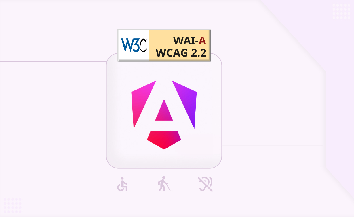
WCAG stands for Web Content Accessibility Guidelines. These guidelines are published by WAI (Web Accessibility Initiative) of W3C (World Wide Web Consortium). Now, WAI was launched in 1997 and to date, its contributions to improve accessibility have always been an important priority. For accessible apps, it is necessary to meet the guidelines of WCAG. By following so, these web apps are rated as A/AA/AAA level of conformance according to the amount of how much content that can be accessible by a disabled user. In angular applications, we can implement such guidelines dynamically. We should make accessible components in order to enhance our user's experience.
WCAG guidelines are categorized into 3 levels of conformance. They are 'A', 'AA' and 'AAA'. Level 'A' is the basic level of conformance, where accessibility issues are addressed and resolved up to some extent. For example, the issues regarding text alternatives and time-based media are addressed here. The solution given by level 'A' for text alternatives is that every non-text content should have text alternatives if that corresponding content is an input control or accepts input from a user. Even for time-based media, the same rule applies. It gets more accessibility as the level increases. By following so, a good and accessible web app can be produced. Not only for text alternatives, there is a list of vast accessibility guidelines that serve different purposes. For example, there are guidelines for just the keyboard accessibility, navigation, etc.
Hire Angular Developer from Angular Minds to get code organization and maintainability for complex applications.
Some Common Practices
The tools that help a disabled user access a web application are screen readers. These tools interpret the information given in a web application. The information so provided is specified in the aria attributes of native HTML elements. Below, some common practices are mentioned which can be used in the angular applications to enhance the experience of a disabled user.
-
Make use of the 'aria-label' attribute for non-text-content HTML elements: During web development , we might come across such scenarios where we have to use some non-textual content. For instance, consider a button inside which we are providing an SVG. Now, a normal user can understand the functionality of that button based on the design of that svg. Below are the images that show the same scenario.
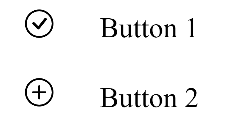
Now, a normal user can easily tell that button 1 will do the functionality of submission while button 2 will perform the functionality of adding. But, in the case of a disabled user, let's say our user is blind, in such cases it becomes impossible to identify the functionalities of buttons as SVG here acts as non-textual content. To overcome this situation we provide an attribute to html elements. In this case, we should use the aria-label attribute for buttons. By doing so, a screen reader can specify the functionalities of these buttons to the user.
Below code snippet below shows the proper use of the aria-label attribute for the buttons.
<!-- index.html -->
<button style="border:none; background: none" aria-label="Save data">
<svg xmlns="http://www.w3.org/2000/svg" width="16" height="16"
fill="currentColor" class="bi bi-check-circle" viewBox="0 0 16 16">
<path d="M8 15A7 7 0 1 1 8 1a7 7 0 0 1 0 14m0 1A8 8 0 1 0 8 0a8 8 0
0 0 0 16" />
<path d="m10.97 4.97-.02.022-3.473 4.425-2.093-2.094a.75.75 0 0
0-1.06 1.06L6.97 11.03a.75.75 0 0 0 1.079-.02l3.992-
4.99a.75.75 0 0 0-1.071-1.05"/>
</svg>
</button> Button 1
<br><br>
<button style="border:none; background: none" aria-label="Add data">
<svg xmlns="http://www.w3.org/2000/svg" width="16" height="16"
fill="currentColor" class="bi bi-plus-circle" viewBox="0 0 16 16">
<path d="M8 15A7 7 0 1 1 8 1a7 7 0 0 1 0 14m0 1A8 8 0 1 0 8 0a8 8 0
0 0 0 16"/>
<path d="M8 4a.5.5 0 0 1 .5.5v3h3a.5.5 0 0 1 0 1h-3v3a.5.5 0 0 1-1 0
v-3h-3a.5.5 0 0 1 0-1h3v-3A.5.5 0 0 1 8 4"/>
</svg>
</button> Button 2
-
use 'ariaCurrentWhenActive' in angular routing: ariaCurrentWhenActive is used for setting the value of aria-current attribute. When we apply this attribute to an element, this will indicate that currently this item is selected inside a container. In angular routing, we can make use of this in order to help the user understand on which page he/she is present. The code snippet below will help you to understand better.
<nav>
  <a routerLink="profile"
     ariaCurrentWhenActive="page"
     routerLinkActive="current-page">
    Profile
  </a>
  <a routerLink="settings"
     ariaCurrentWhenActive="page"
     routerLinkActive="current-page">
    About
  </a>
  <a routerLink="dashboard"
     ariaCurrentWhenActive="page"
     routerLinkActive="current-page">
    Dashboard
  </a>
</nav>
Every time our user routes to a new page, he/she will have an idea of on which page currently the route is. This is one of the good practices of implementing angular accessibility in our project using the accessibility feature of angular material i.e. ariaCurrentWhenActive.
-
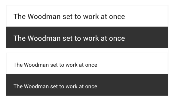
Use of proper contrast ratios: With the help of a proper color contrast ratio, users can distinguish between text and non-text HTML elements. Having a high contrast, the user can easily see the image. Based on low light conditions or even bright light, it is difficult for some users to see an image whose contrast is low. High contrast mode can make the image lose its original meaning, so a proper contrast ratio is mandatory just like for modal dialogs, monitoring focus is very important.
It is recommended to use a color contrast ratio of 3 :1 against the background for large graphics and text. For normal text, the ratio is 4.5 :1. The image below is a good example of where a proper contrast ratio is maintained.
Conclusion
Till now, we have discussed the necessity of accessibility in web development. The role of WCAG, screen readers, etc. followed by mentioning some small practices, which one should follow to make our angular components accessible to our users.
Although we have semantic HTML elements like form, article, table, etc. which clearly show what their purpose is. But, for non-semantic HTML elements like div or span, we cannot predict the type of data that it will store. It might store textual data or imagery data. For such elements, it becomes a duty to identify the purpose of these native elements inside a web app. For disabled users, screen readers are a necessary tool by which they can understand a web app.
Our final goal is to create accessible experience for users with disabilities.

Related articles