How to Build Reusable and Maintainable Angular Components
Building Reusable and Maintainable Angular Components
Building reusable components is a key aspect of creating efficient Angular applications. Angular simplifies this process, helping developers cut down on repetition and enhance code efficiency.
Angular is all about making code reusable. These versatile building blocks easily fit into different parts of your Angular application. To be truly reusable, they should be generic and free from complicated business logic.
In this blog, we explore the ins and outs of building reusable Angular components, allowing Angular developers to improve their coding skills.
What are the reasons why you should use reusable Angular components?
Using an Angular component gives you the following benefits.
Code Reusability -
You can write code once, and it can be used in multiple places.Maintenance -
When a change is required, you only need to update the reusable component in one place.Scalability -
As the Angular application grows, less complexity is required. Thus the same component file can be used for similar functionalities.
What are Angular Components?
An Angular component is a basic building block of an Angular application. It has a /selector, template URL or html template block, style, and many other useful properties.
You can create a new component file from Angular CLI by using the following command :
Ng generate component <component-name> OR ng g c <component-name>
For example, we have created a header component by using the command (ng g c header).
The following files will be added to the project.
Header.component.html // for adding HTML template
Header.component.spec.ts // for adding testing functionality
Header.component.ts // for adding logic or event functionalities.
Header.component.scss // for adding necessary styles.
There are two ways in which we can use a reusable Angular Component
By using element selectors
By using content projection with the help of templateRefs/ng-content
1. By Using Element Selectors:
Consider this hierarchy:
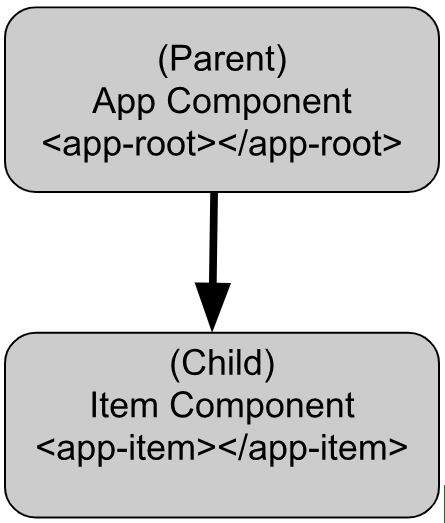
With the help of @Input and @Output we can achieve data communication between parent and child components.
@Input() lets a parent component update data in the child component and @Output() lets the child send data to a parent component.
Configuring Parent Component:
<div>
<h1>Welcome to Home Page</h1>
<div *ngFor="let item of items">
  <app-item [item]="item" item-class="bg-secondary"
(itemEvent)="getItemEvent($event)">
</app-item>
</div>
</div>
Here we used the component's selector of the ‘app-item’ component manually inside app.component.html and passed data from parent to child.
The target in the square brackets [ ], is the property you decorate with @Input() in the child component. The part to the right of the equal sign is the data that the parent component passes to the nested component file.
To obtain the itemEvent emitted by an item component, establish a method specifically designed to capture this event from the said component files.
When an item card is clicked, the getItemEvent method in the AppComponent will be triggered, and you can handle the event accordingly.
app.component.ts
import { Component } from '@angular/core';
import { ItemComponent } from './item/item.component';
import { NgFor } from '@angular/common';
import { Item } from './item.interface';

@Component({
standalone: true,
selector: 'app-root',
templateUrl: './app.component.html',
imports: [ItemComponent, NgFor]
})

export class AppComponent {
items: Item[] = [
  { id: 1, name: 'Item 1', description: 'Description for Item 1' },
  { id: 2, name: 'Item 2', description: 'Description for Item 2' },
];

getItemEvent(event: Event) {
  // add your logic here...
}
}
Configuring Child Component:
item.component.html
<div class="card" [ngClass]="className" (click)="itemEvent()">
<div class="card-header">
  {{ item?.name }}
</div>
<div class="card-body">
  <p>{{ item?.description }}</p>
</div>
</div>
item.component.html
<div class="card" [ngClass]="className" (click)="itemEvent()">
<div class="card-header">
  {{ item?.name }}
</div>
<div class="card-body">
  <p>{{ item?.description }}</p>
</div>
</div>
item.component.ts
import { Component, EventEmitter, Input, Output } from '@angular/core';
import { Item } from '../item.interface';
import { CommonModule } from '@angular/common';

@Component({
standalone: true,
selector: 'app-item',
templateUrl: './item.component.html',
imports: [CommonModule]
})

export class ItemComponent {
value!: string;

@Input() item!: Item;
@Input() className!: string;

@Output() newItemEvent = new EventEmitter<string>();

itemEvent() {
  this.newItemEvent.emit(this.value);
}

updateItem() {
  // your logic here ...
}
}
In this case, @Input decorates the property item, which has a type of string, however, @Input() properties can have any type, such as number, string, boolean, or object. The value for the item comes from the parent component.
The @Output() decorator in a child component or directive let's data flow from the child to the parent.
The child component uses the @Output() property to raise an event to notify the parent of the change. To raise an event, an @Output() must have the type of EventEmitter.
To see for changes on an @Input() property, use OnChanges(Angular lifecycle hook).
Using ViewChild with Child Components
Another way to access child components is by viewChild() decorator and for multiple child components use viewChildren() decorator.
ViewChild makes it possible to access and call methods or to access instance variables that are available to the child.
app.component.ts
@ViewChild(ItemComponent) item!: ItemComponent;
  ngAfterViewInit() {
    console.log(this.item.updateItem());
  }
In the parent component, it waits for the AfterViewInit lifecycle hook to access the variable, as this is when child components and directives become available.
More information:
2. By using content projection with the help of templateRefs/ng-content
Users can choose any of the methods mentioned above depending on the requirements of the developing Angular application.
For example, if you have a simple app then passing inputs to the components will be sufficient. But if you need more customization you can choose a content projection method.
For dynamically template rendering ngTemplateOutlet is widely used. It fulfills the need to reuse a template in multiple places and customizations. One of the important things that needs to be kept in mind is that the Ng-template has a lazy loading rendering.
Here is the basic syntax :
<ng-template [ngTemplateOutlet]="listRef" [ngTemplateOutletContext]="{data: items}"></ng-template>ngTemplateOutlet gives the information about the template to be rendered and context provides info about the data to be used.
Angular Minds has the perfect Angular Development Services to enhance the speed and support your web application. Get on a quick call with our CEO.
Create display-product component:
Here, display-product component will be shared in various components.
<table class="table">
  <tr>
      <th ngFor="let heading of headings">
          {{heading}}
      </th>
  </tr>
  <tr ngFor="let row of rowData">
      <td *ngFor="let col of colsTemplate">
          <ng-template [ngTemplateOutlet]="col
[ngTemplateOutletContext]="{data:row}">
          </ng-template>
      </td>
  </tr>
The display-product component will take multiple inputs for binding headings, and row data, and one that will take the template of each column.
Display-product.component.ts
export class DisplayProductsComponent implements OnInit {

constructor() { }

@Input() rowData : any[];
@Input() colsTemplate: TemplateRef<any>[];
@Input() headings: string[];

ngOnInit(): void {
}
Create products component :
Now product component is created that will provide inputs to the display-product component.
<h3 class="text-center text-secondary">Employees</h3>
<app-display-products [rowData]="products" [colsTemplate]="cols
[headings]="headings">
</app-display-products>


<ng-template #id let-data="data">
  <span class="badge badge-dark">{{data.id}}</span>
</ng-template>
<ng-template #name let-data="data">
  <span class="badge badge-success">{{data.name}}</span>
</ng-template>

<ng-template #price let-data="data">{{data.price}}</ng-template>
<ng-template #validity let-data="data">{{data.validity}}</ng-template>
We will take hard-coded data here to understand and get more clarity on the concept.
Here, four ng templates are used to define the template of different columns(id, name, price, validity). These templates have references in the component class and are stored in an array. Let data be the context that will be passed to display-product.
export class ProductsComponent {

products = [
{
    id: 1,
    name: 'product1',
    price: '100',
    validity: "2025"
},
{
    id: 2,
    name: 'product2',
    price: '200',
    validity: "2014"
},
];

headings = [
'Id',
'Name',
'Price',
'Validity'
];

@ViewChild('id', { static: true }) id;
@ViewChild('name', { static: true }) name;
@ViewChild('price', { static: true }) price;
@ViewChild('validity', { static: true }) validity;

cols: TemplateRef<any>[] = [];

ngOnInit(): void {
this.cols.push(this.id, this.name, this.price, this.validity);
}
}
Let’s see another component i.e. product-list which also uses the same product component. This time, the product-list component will define the templates of columns as required.
Create product-list component :
Here, the product-list component has only two columns for displaying. Two ng-template blocks are used to render data. Data from ng-template is passed to input property colsTemplate.
<h3 class="text-center text-secondary">Quantity Available</h3>

<div class="d-flex justify-content-center">
  <div class="w-50 text-center">
      <app-display-products [rowData]="itemsAvailable"
[colsTemplate]="[name,stock]" [headings]="headings">
      </app-display-products>
  </div>
</div>
<ng-template #name let-data="data">
  <div class="border-primary text-primary">{{data.name}} </div>
</ng-template>
<ng-template #stock let-data="data">
  <span>🏠 {{data.stock}}</span>
</ng-template>
Product-list.component.ts :
Again we are using a dummy data list i.e. itemsAvailable and passed to its HTML template.
export class ProductListComponent {
itemsAvailable = [
{
name: 'Bucket',
stock: '100'
},
{
name: 'Tiffin',
stock: '100'
},
{
name: 'Bottle',
stock: '100'
},
{
name: 'Basket',
stock: '100'
}
]
headings = [
'Name',
'Quantity'
];
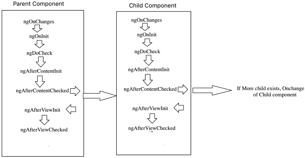
}Lifecycle Hooks execution sequence after using child component:
Conclusion
In this blog, we studied two ways of creating a reusable Angular component.
The first method is by passing inputs and using css selector of the components. The other way comes into the picture when we need more customization and handling of complex data. Instead of ng-content, template Ref is preferred due to its performance and maintainable functionality.
The advantages of employing a reusable Angular component outweigh the potential drawbacks. The development of modular, reusable components proves instrumental in saving time and diminishing code intricacies, ultimately contributing to the creation of more scalable and maintainable Angular applications.
As the complexity of simple components escalates, their utility and maintainability diminish. This underscores the significance of crafting reusable Angular components. By doing so, we facilitate the seamless transfer of crucial data between components, allowing for efficient access within each module.
The simplicity and maintainability inherent in reusable components make them a practical and effective choice.

Related articles