Angular Animations: A Beginner's Guide
Brief: This informational guide walks you through basic transitions, advanced techniques like Web Animations integration, performance tips, and best practices for making animations not just stylish but purposeful, accessible, and optimized for real-world applications. You will be discovering how to bring life to your Angular apps using built-in animation tools for appealing visuals.
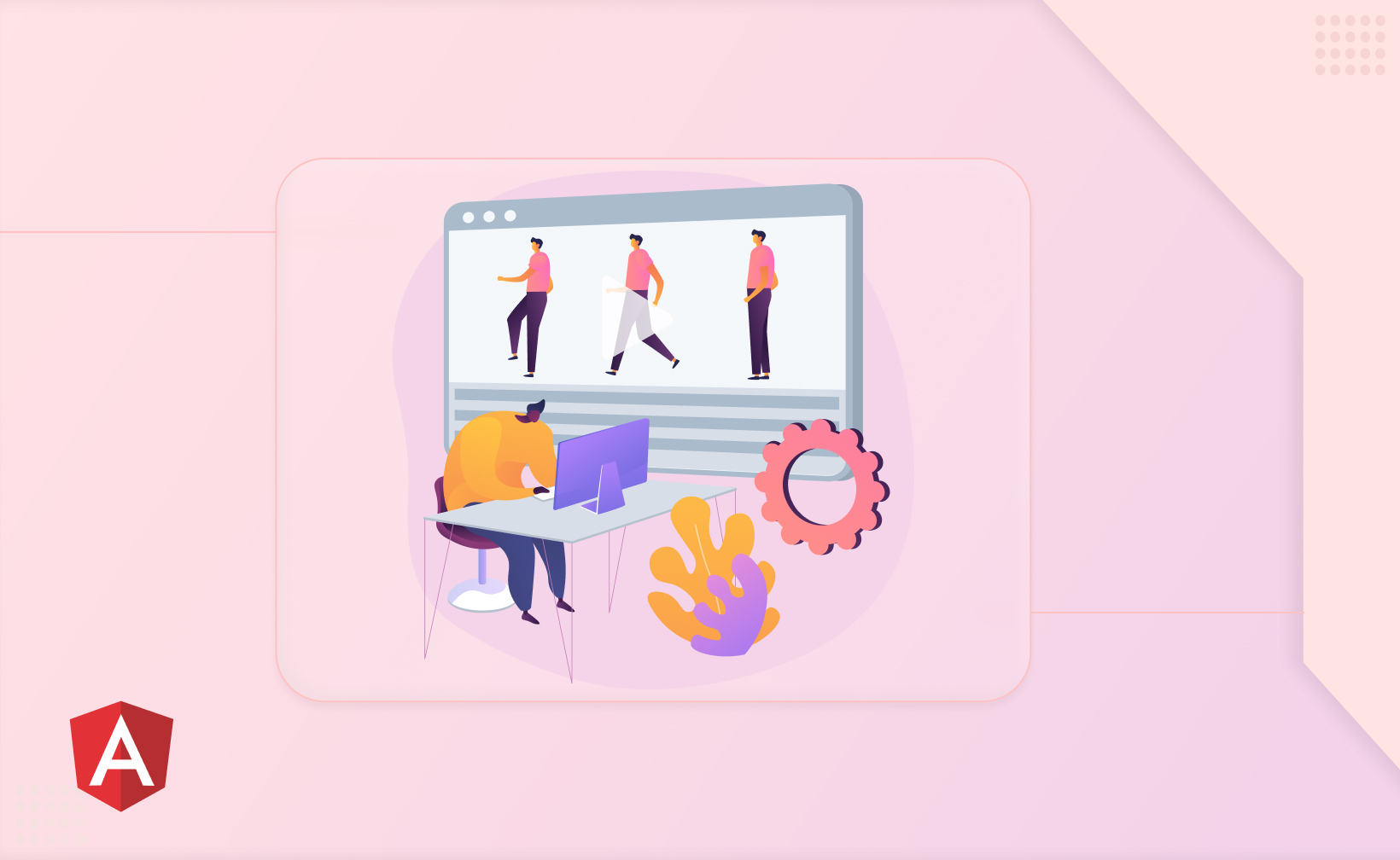
Did you come across a website that looked old-school and felt dull? However, will you be attentive if you click on a button and see colors changed, expand gracefully, and traditions smoothly to an entirely new state?
How do you bridge the gap? Animations are your solution. Animation is a whirlwind in the web application and development. They put life into your applications, making them compelling and dynamic. So, if you are trying to create a beautiful user experience with animations, Angular is your unified answer.
The Essential Contributors
Think of the above example of angular animations like a play or skit:
Animation Trigger: This is the script that defines the different scenes i.e. animation states and transitions between them.
Animation Functions: The actors, carry out particular actions like changing styles or timings.
CSS Style: The costumes, showcase how elements appear in each scene.
HTML Element: The stage, where it all came together.
Setting the Stage
To enable animations in your Angular project, import the provideAnimations module and add it to your provider's array in the bootstrap function. Now, let's step up in this process and curate our first animation.
Simple Transition Example
Imagine a button that grows when clicked. We'll define a trigger named growShrink with two states: small and large, and a transition to animate between them.
component file
@Component({
  selector: 'app-example',
  // ...
  animations: [
    trigger('growShrink', [
      state('small', style({ height: '50px' })),
      state('large', style({ height: '200px' })),
      transition('small <=> large', animate('300ms ease-in-out'))
    ])
  ]
})
export class ExampleComponent {}
In your HTML or components template, attach the trigger to the button using its name in square brackets:
Component's Template
<button [@growShrink]="'large'">Grow</button>
When the button element is clicked, it'll smoothly grow from 50px to 200px over 300 milliseconds with an ease-in-out timing, thanks to the magic of Angular animations.
Expanding Your Animation Repertoire in Angular
Learning the basics of Angular animations is just the first step. Now, let's see some advanced techniques to create truly impressive and dynamic effects:
1. Multiple Animations
Chain Animations: Combine multiple animation triggers and functions within a single component to create sequences like a loading indicator that spins while fading in or a button that shrinks, pulses, and changes color on click.
Nested Animations: Use triggers within other triggers to build complex hierarchies. Imagine a list item that slides in, then its sub-items fade in one by one with different timings.
Simultaneous Animations: Combine triggers on different elements to create coordinated movements. Picture a modal opening while content fades out beneath it, creating a smooth transition.
2. Web Animations Integration
Utilise query: Select specific child elements within an animation and apply targeted styles or animations to them. Animate only the relevant parts instead of the entire element.
Leverage style: Directly manipulate CSS properties within your CSS animations using style. Go beyond pre-defined transitions and create unique effects like custom easing curves or property-specific timing.
Unlock animateChild: Synchronise animations across parent and child components. Imagine a menu expanding while its child items animate into place seamlessly.
3. Component Interactions
Shared Animation States: Define animation states across multiple components. Use the same state name to trigger synchronized animations, creating a cohesive flow between different app sections.
State Management with Services: Manage complex animation state transitions across components using services, ensuring consistency and avoiding conflicts.
Event-Driven Coordination: Trigger animations in response to events emitted by different components, creating interactive and responsive experiences.
4. Custom Easing Curves
Cubic-Bezier Functions: Define unique easing curves using cubic-bezier functions. Control the acceleration and deceleration of animations, creating custom movement patterns beyond standard timings.
Tailored Timing Curves: Match animation behavior to specific design requirements. Imagine a bouncing effect with a smooth ease-in and a sharp ease-out for a playful feel.
Explore Libraries: Utilise existing libraries like angular-animation-easing for pre-built easing curves and advanced animation tools.
Looking to grab user attention with Animation in Angular?
Angular Minds, a leading Angular Development company can help your business increase user activity and engagement on your application for longer periods.
Animations can be a powerful tool to enhance your Angular applications, but it's crucial to use them wisely to avoid hindering user experience and performance. Here's a deeper dive into the essential best practices:
1. Start Simple
Less is More: Don't overload your app with flashy, complex animations that take too long to render. Simple, subtle animations can be surprisingly effective.
Performance First: Prioritise smooth, lag-free interactions by avoiding overly intensive animations that strain your app's resources.
Consider Responsiveness: Ensure animations work well across different devices and screen sizes, avoiding layouts that break due to complex transitions.
2. Purpose Drives Motion
Clarity Above All: Don't use animations just for decoration. Each animation should serve a clear purpose, like guiding users through the interface or highlighting important actions.
Feedback and Focus: Use animations to provide feedback on user interactions, like button presses or form submissions. Highlight changes in state or content to keep users focused.
Avoid Distractions: Don't distract users with unnecessary animations that compete for attention or impede their tasks.
3. Accessibility Matters
Everyone Included: Ensure animations don't create barriers for users with disabilities. Follow accessibility guidelines such as using sufficient color contrast, providing alternative text for decorative animations, and avoiding content flickering or strobing.
Keyboard Compatibility: Make sure animations don't interfere with keyboard navigation. Allow users to interact with elements even when animations are ongoing.
Screen Reader Awareness: Describe animations using ARIA attributes, allowing screen readers to convey the changes accurately to visually impaired users.
4. Optimise for Performance
Keep it Lightweight: Use efficient CSS transitions and avoid unnecessary DOM manipulations within animations. Optimise animation speeds and minimize their duration.
Minimise Repaints and Reflows: Avoid animations that trigger frequent repaints or reflows of large areas of the screen, as this can significantly impact performance.
Utilise Animation Libraries: Consider using well-optimized animation libraries designed for Angular to handle complex animations efficiently.
Remember
Test Early and Often: Test animations across different devices and browsers to ensure smooth performance and compatibility.
Measure and Track: Use performance profiling tools to measure the impact of animations on your app's loading time and responsiveness.
Iterate and Improve: Don't be afraid to experiment and refine your animations based on user feedback and performance data.
By following these best practices, you can ensure that your animations enhance your Angular apps without sacrificing performance or accessibility. Remember, user experience is paramount, and animations should complement it, not detract from it.
Angular Animations: From Trigger to Execution
Angular animations offer a powerful way to bring your applications to life, adding dynamism good animations, and engaging interactions. But how does it all work under the hood? Let's delve into the mechanics of Angular animations, from their definition to execution:
1. Setting the Stage
Triggers: Think of these as the scripts, defining the different animation states (like "visible" or "hidden") and transitions between them. You define triggers within your component's metadata using the animations property. This is an animation trigger.
Animation Functions: These are the actors on stage, each carrying out specific actions like changing styles or defining timings. Common functions include state, transition, and animate.
CSS Styles: The costumes! CSS styles define the visual appearance of elements in each animation state through CSS properties like opacity, transform, and background color.
2. Cue the Action
Trigger Activation: You bind triggers to HTML elements using the trigger name in square brackets ([@triggerName]="stateName"). When the specified state changes (based on your logic), the animation kicks in.
Trigger Evaluation: Angular parses the trigger definition, matching the current state and intended state to the defined transitions.
Transition Selection: The relevant transition function (transition('initialState <=> finalState', ...) is chosen based on the state change.
Animation Step Execution: The animate function within the transition is executed, applying the defined style changes over the specified duration using CSS transitions.
3. Performance Considerations
Optimizing Triggers: Avoid creating too many triggers or overly complex transitions, as these can impact performance.
Using Web Animations: For advanced control and efficiency, leverage query, style, and animateChild functions to access the power of web animations.
Accessibility Matters: Ensure animations don't hinder accessibility by following best practices like providing alternative text and avoiding excessive flashing elements.
4. In-Depth Breakdown
Imagine a button that shrinks when clicked. Here's how the animation unfolds:
You define a trigger named shrink with two states: active and inactive, and a transition between them using animate.
In your HTML template, you bind the trigger to the button using [@shrink]="isActive".
When the button is clicked, isActive changes from true to false.
Angular selects the transition for initialState = 'active' <=> finalState = 'inactive'.
The animate function within the transition executes, applying the defined changes (e.g., reducing width and height) using a CSS transition over the specified duration.
Example Scenario :
You have a simple toggle button that switches between displaying "Show More" and "Show Less" text when clicked. You want to animate this text change with a subtle fade-in/fade-out effect.
Code Structure:
TypeScript code snippet
// component.ts
@Component({
  selector: 'app-toggle-button',
  templateUrl: './toggle-button.component.html',
  animations: [
    trigger('textToggle', [
      state('showMore', style({ opacity: 1 })),
      state('showLess', style({ opacity: 0 })),
      transition('showMore <=> showLess', animate('200ms ease-in-out'))
    ])
  ]
})
export class ToggleButtonComponent {
  showMoreActive = true;

  toggleText() {
    this.showMoreActive = !this.showMoreActive;
  }
}
HTML code snippet
<button (click)="toggleText()">
  <span [@textToggle]="showMoreActive ? 'showMore' : 'showLess'">
    {{ showMoreActive ? 'Show More' : 'Show Less' }}
  </span>
</button>
Explanation
Trigger and States
We define a trigger named textToggle with two states: showMore and showLess. Each state defines the opacity of the text using CSS: showMore is fully opaque (visible), while showLess is transparent (hidden).
Transition: We create a transition between these states using transition. This defines when the animation occurs: whenever the state changes between showMore and showLess.
animate Function: Inside the transition, we use animate to specify the animation's duration and timing. Here, it fades in/out over 200 milliseconds with an ease-in-out timing for a smooth effect.
Trigger Binding: In the HTML template, we bind the textToggle trigger to the <span> element containing the text. We use a conditional expression based on the showMoreActive flag to determine which state (showMore or showLess) should be applied.
Key Insights
State-based Transitions: Animations respond to state changes, not element interactions directly. In this example, clicking the button changes the showMoreActive flag, which triggers the state change and animation.
CSS Integration: Animation styles are defined using CSS within the states. This allows for fine-grained control over visual changes during the animation.
Conditional Expressions: You can use expressions within state references to select animation states based on your application logic dynamically.
Performance Considerations: Keeping animations lightweight (short duration, simple styles) and focusing on meaningful transitions improves user experience and app performance.
Things to Remember
The transition function accepts two arguments: the transition expression and an animation step or sequence.
The animate function defines a style change over time, accepting duration and timing as arguments.expand_more
Refer to your HTML template file where you apply animation triggers on elements.
The void state represents elements entering or leaving the DOM.
FAQs

Related articles